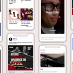
As we usher in a brand new year, we have so much to share with you! Our latest release includes a new style guide, Read-Only Conversation, performance enhancements and more.
Improved design and user experience
At OpenWeb, we believe that creating inviting spaces for users to interact promotes engaging and quality conversations. After months of planning and design explorations, our new streamlined style guide is now being rolled-out across our network.
The new designs include a range of elements within the Conversation and User Profiles. From menus, modals to buttons and typography—we got it all covered.
The enhancement also included features that promote journalist involvement in the conversations. Now your staff or editorial team can have unique themes or colors for their system-generated initial avatars. And badges can be customized to have full color or just an outline.
A significant number of active users appreciate an opportunity to converse with experts such as journalists or editors to form a deeper bond with the publisher. Using badges can directly impact active user engagement.
These design updates will ensure all of our components:
- Have a universal look and feel
- Are WCAG 2.1 AA accessible
- Could be quickly adapted based on partner needs
Gain better ROI on your moderation efforts
With the right moderation tools publishers can better manage the health of their communities, gain increased benefits from their moderation efforts—ultimately allowing for more respectful interactions and fewer harmful comments.
We also want you to employ your moderation resources where it matters. With this in mind, OpenWeb is now offering a Read-Only Conversation feature for our partners. The feature enables Moderators and Admins to turn off commenting by article after a certain period of time or at their discretion.
You can now turn this on for a specific article via the gear icon on the Conversation unit, or globally for all the articles within the OpenWeb admin dashboard. Read more about the feature here.
Augmenting real-time interactions
Our real-time typing indicators and avatars play a significant role in catching user attention and improving engagement.
We now display the total number of engaged users in the conversation—right at the top —instantly boosting more interest. Previously this displayed the avatars of registered users only.
You also have the ability to disable this within the OpenWeb admin panel or ask your Partner Success Manager to do so.

For partners that allow guest commenting, our Say Control is now dramatically less real-estate hungry. Showing only the comment field by default and expanding on click to allow guests to quickly add a new comment, and enter their name/nickname to participate in the conversation. We also save their temporary nickname for their next comment.
This enhancement reduces friction, and creates a cleaner and more focused user experience, prompting guests to take action.

We no longer generate random usernames (remember greenturtle?), so this also helps in enhancing user identity by creating avatars that are based on the user’s name.
Performance, performance, performance!
That’s our mantra for 2021! We are on a mission to make our product the lightest in the market. Below are a few performance enhancements that are part of this release to make loading experience faster and smoother:
- More lazy-loaded modules than before
- Improved boot logic
- Usage of shared SVG icons
- Skeleton loader for user tooltip
We have also improved how we treat link embeds within comments. For example, links to Facebook posts now use native embeds instead of a generic link preview.
Last but not least, on the data side of things we now offer new event listeners for the click on cog menu, message context menu and more. See our Developers Hub for a full list of supported event listeners.
These features are being rolled out gradually across the OpenWeb network. If you need more information or have any questions, please reach out to your Partner Success Manager.


